

Typography / Research draft
Typeface comparisons and passenger tasks
The typography study records the application and exact font revision before comparing specimens. It examines visible size, layout and writing-system coverage, with original font subsets prepared for further testing.
Selected findings
Version and application
The documentary cases distinguish sign-specific cuts, screens and matrix displays. A family name alone does not identify the exact application or file revision.
Comparison conditions
Equal point size can produce different visible letter heights. A layout change can also affect an outcome attributed to a typeface.
Checks across writing systems
Character coverage, shaping, regional forms and fluent-reader performance are separate checks. The research subsets have limited coverage.
From evidence to design
OTI proposals
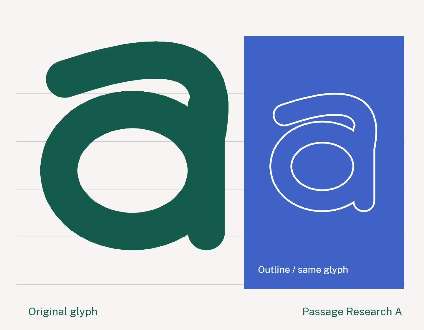
An application record
Record task, language, script, medium, dimensions, font revision, rights and review evidence.
Resources for each writing system
Preserve authorised names and coordinate suitable script resources. Public Sans remains the interface typeface.
Comparative research specimens
Use the editable Passage Research and Matrix subsets in comparisons with existing baselines. No passenger-effectiveness winner has been established.